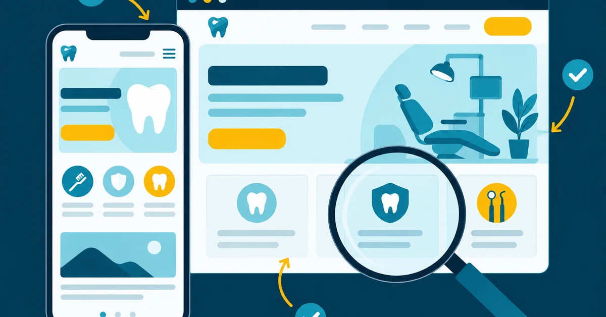
Most dental websites lose patients on the first screen. Dan Brian walks through a typical dental site top to bottom and shows what actually turns visitors into booked appointments.
Most dental websites don't fail because they're ugly. They fail because a patient lands on them with a question — can I get in this week, do you take my insurance, is this going to hurt — and the site makes them work to find the answer. So they hit the back button and call the next practice in the map pack.
We review a lot of dental websites, usually right before a practice hires us. The same handful of problems show up again and again, and almost none of them are about design taste. They're about whether the site turns a visitor into a phone call.
So instead of a list of "modern design trends," here's a teardown: we walk down a typical dental homepage from top to bottom, then through the service pages and the booking path. At each stop we show what we usually find, and what a site that converts does instead.
What "Converts" Actually Means for a Dental Practice
A dental website has one job: produce new patient calls, form fills, and booked appointments. Not time on site, not a design award. If you can't see how many new patients your site produced last month, broken down by source, start there. Everything below is easier to judge once you have that number.
Every page should answer three questions within a few seconds of landing:
- Is this practice right for me? (services, location, insurance, who the dentist is)
- Can I trust them? (reviews, real photos, credentials)
- How do I book? (one obvious next step)
Stop 1: The First Screen
This is the part a visitor sees before scrolling, and on a phone it's small. It decides whether they stay.
What we usually find
- A rotating slider with three stock photos and a slogan like "Creating Beautiful Smiles"
- No phone number, or one in small grey text in the corner
- A menu with twelve items and no clear button to book
What converts
- A plain-English headline that says who you are and where: "Family & Cosmetic Dentistry in Grand Rapids" beats any slogan.
- One primary action ("Book an Appointment" or "Call Now") plus the phone number as a tap-to-call link. On mobile, a sticky call/book bar at the bottom of the screen.
- Proof right away: your star rating and review count, and "Accepting new patients" if that's true.
- A real photo of your doctor, team, or office. Stock photos of models with perfect teeth tell the visitor nothing about you.
Drop the slider. Visitors rarely wait for slide two, and sliders slow down the page.
Stop 2: Speed and Mobile
Most of your new-patient traffic is on a phone, often from the Google map pack, often from someone who wants to call now. A slow site loses that person before they see anything.
What we usually find
- Huge uncompressed images, auto-playing background video, and a pile of plugins on an aging template
- Pop-ups covering the screen on mobile
- Buttons and links too small to tap
What converts
- Pages that load fast on a phone over cellular, checked with Google's PageSpeed Insights, not on the office Wi-Fi.
- Compressed modern image formats, no auto-play video above the fold, and only the scripts you actually need.
- A layout designed for the phone first, then scaled up for desktop, not the other way around.
Stop 3: Trust Signals
Patients are picking someone who will have their hands in their mouth. They want reassurance before they call.
What we usually find
- A "testimonials" page nobody visits, with three quotes from 2017
- A doctor bio that's a list of continuing-education courses
- No photos of the actual office
What converts
- Recent Google reviews shown on the homepage and on service pages, pulled in automatically so they stay current. (A steady flow of new reviews matters for rankings too. That's what review generation handles.)
- Doctor bios written for patients: why they became a dentist, what they're like chairside, what they do outside the office, with a real photo. Credentials go at the bottom.
- Real photos of the office, the team, and the technology.
- Before-and-after cases on cosmetic and implant pages, with patient consent on file.
Stop 4: Service Pages
This is where most dental sites leave the most money on the table, for both conversions and SEO. Patients search for dental implants near me or emergency dentist open Saturday, not "general dentistry."
What we usually find
- One "Services" page listing twenty treatments in a bulleted list
- Or separate pages with 150 words of generic copy that could belong to any practice in the country
- No call to action on the page at all
What converts
- A dedicated page for every service you want more of: implants, Invisalign, emergency care, sedation, veneers, and so on.
- Each page answers the real questions: who it's for, what the visit is like, how long it takes, whether it hurts, what it costs or how financing works, and whether insurance helps.
- A booking call to action at the top, the middle, and the bottom of the page.
- An FAQ section. It helps patients, and it's the kind of clear question-and-answer content Google's AI Overviews, ChatGPT, Gemini, and Claude pull from when they answer dental questions. (That's the work we call generative engine optimization.)
Stop 5: The Booking Path
A visitor who's ready to book is the most valuable person on your site. Don't make them hunt.
What we usually find
- A contact form asking for twelve fields, including date of birth and insurance ID
- Forms that send to an inbox nobody checks after 5pm
- Online scheduling hidden three clicks deep, or missing
What converts
- Short forms: name, phone, email, reason for visit, preferred time. Collect the rest when they're on the phone with your front desk.
- Online scheduling, if your practice can support it, linked from every page.
- A clear promise of what happens next ("We'll call you within one business hour").
- Privacy-safe forms: no health details sent through tracking tools, and secure handling of anything a patient submits.
Then make sure the phone gets answered. The best website in the world can't fix a voicemail on a Tuesday morning. If you have call tracking with recordings, listen to a few new-patient calls each month.
Stop 6: Local SEO Basics Built Into the Site
Design and SEO aren't separate projects. A site that looks great but Google can't understand won't get the visitors in the first place.
- Your practice name, address, and phone number match your Google Business Profile exactly
- Each page has its own title and meta description, written for the search it targets
- Schema markup tells search engines you're a dental practice, where you are, and your hours
- Location pages, if you serve more than one town or have more than one office
- Clean URLs and working redirects, especially after a redesign. A rebuild without redirects can wipe out years of rankings.
Our complete guide to dental SEO covers the full picture.
Stop 7: Accessibility
Website accessibility is a patient experience issue and a legal one. Dental practices have been targets of ADA website lawsuits. The basics: readable text sizes and contrast, image descriptions (alt text), forms that work with screen readers, and a site you can navigate with a keyboard. We cover the legal side in ADA website compliance lawsuits against dental practices.
Redesign or Fix What You Have?
Not every practice needs a new website. Fix what you have if the site is reasonably fast, you own it, and the problems are mostly content: thin service pages, a weak first screen, missing reviews. Rebuild when:
- The site is slow on mobile no matter what you do to it
- It's locked on a platform you can't edit or don't own
- Adding a service page means calling your old agency and waiting two weeks
- The structure is so tangled that fixing it costs nearly as much as starting over
If you do rebuild, that's what our dental website design process is built around: conversion first, then SEO, speed, and accessibility from day one. Either way, you should own your website and domain outright. If you're not sure whether you do, ask today. (It's one of the ten questions we tell practices to ask any agency.)
A 10-Minute Self-Check
Pull up your own site on your phone, as if you were a new patient, and check:
- Can I tap to call within one second of the page loading?
- Does the first screen say what you do and where?
- Can I see your reviews without scrolling to the footer?
- Is there a real photo of your doctor and office?
- Does every major service have its own page with a booking button?
- Can I request an appointment in under a minute?
- Does the page load fast on cellular data?
- Do you know how many new patients the site produced last month?
If you answered "no" to three or more, your website is costing you patients. We wrote more about that in why your dental website is costing you patients.
TL;DR
- A dental website converts when it produces new patient calls and booked appointments. Judge it on that, not on looks.
- The first screen needs a plain headline with your location, tap-to-call, one booking button, your review rating, and a real photo. Drop the slider.
- Build for the phone first and keep it fast on cellular data.
- Give every high-value service its own page with real answers, an FAQ, and booking calls to action. That also helps you show up in AI search.
- Keep forms short, answer the phone, and track every lead to its source.
- Make sure SEO basics and accessibility are built in, and always own your website and domain.
Want Us to Tear Down Your Website?
Book a free strategy call and we'll walk through your site the same way, top to bottom, and show you the changes most likely to bring in more new patient calls. No cost, no obligation.
Schedule Your Free Strategy CallTags

About the Author
Dan Brian
Co-Founder & Director of Client Services, DentalScapes
Dan Brian is co-founder and Director of Client Services at DentalScapes. A recognized early adopter of AI in dental marketing, Dan has been experimenting with and deploying AI tools since before they became mainstream — from AI-assisted content and Generative Engine Optimization (GEO) to predictive campaign analytics. He leads DentalScapes' marketing education programs for practice owners, including The Dental Marketing Mix podcast and The Dental Domination Program book.